Must-See Facebook Ad Examples: How to Replicate Their Success
2025-02-19
If you want to boost sales and drive more conversions with your Facebook ads, the key is creating ads that stand out.
So, what’s the secret to creating high-converting Facebook ads? Learning from the best in the business.
In this article, we’ll look at some of the best Facebook ad examples from top brands in different industries. You’ll see what makes these ads effective — everything from ad design and messaging to emotional triggers and calls to action. We’ll also break down how to apply these best practices to your campaigns.
Ready to create attention-grabbing Facebook ads that actually work? Let’s dive in.
What makes a Facebook ad effective?
Creating an effective Facebook ad is not just about making your ad look good — it’s about connecting with your audience and driving them to take action. Here’s what goes into a winning ad:
1. Ad creatives that match the goal
Before you start running your Facebook ads, think about what you want your ad to achieve.
- Want more sales? Use visuals and messaging that guide people toward making a purchase and add the right incentive.
- Want more brand awareness or traffic? Introduce people to your brand, show them how you can help solve their problems, and guide them to learn more on your website.
Matching the design and message of your Facebook ad to your goal is crucial for success.
2. Highlighting the USP (Unique Selling Proposition)
Your Facebook ads are far from the only ones showing up in your audience’s feed — you’ll have plenty of competitors to beat if you want people’s attention only on your offers. Facebook ads that show what makes a product or service special stand out and give people a reason to pause.
3. Talking directly to the target audience
The more specific a Facebook ad is, the better the results will be. That’s because effective ads usually focus on a well-defined audience and address their pain points instead of trying to speak to everyone. A personalized approach leads to higher engagement and more conversions.
4. Ad visuals and copies that go well together
Your visuals and text should tell the same story. If your image says one thing and your copy says another, it’s confusing. A unified message helps people quickly understand what you’re offering and why it’s worth their time.
5. Matching landing page
Once someone clicks on a Facebook ad, they should land on a page mathicng the ad they saw. This means everything has to be consistent, from visuals and CTAs to messaging and the offer itself. Consistency builds trust and increases the chance of conversions.
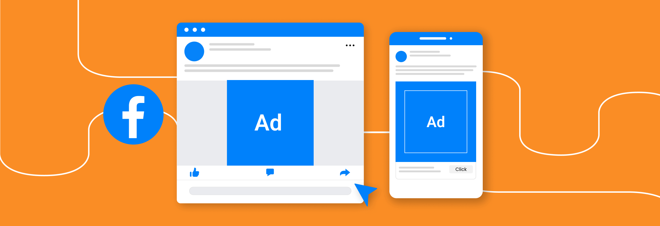
As you know, Facebook ads come in different formats: single images, videos, carousels, etc. Now, we’ll go through several Facebook ad examples for each ad format to give you inspiration for your next campaign. It’s a masterclass in action, so make sure to pay attention — you can improve your own Facebook ads by learning from the best.
Facebook Image Ads examples
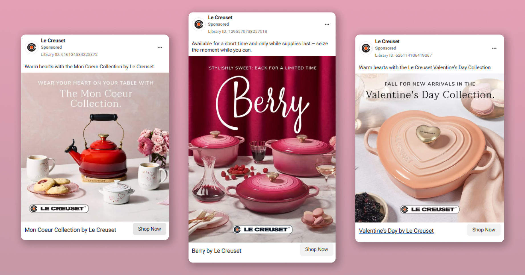
Le Creuset
Le Creuset’s Facebook ads always tap into the brand’s personality and image, blending premium aesthetics with emotional storytelling to make their products feel both desirable and approachable.
Why it works:
1. Imagery that matches brand’s aesthetic
The ads use thoughtful color combinations and a clean layout to draw attention directly to the products without overwhelming viewers. The imagery evokes moods like a relaxing morning or a cozy Valentine’s dinner, making it easy for the audience to imagine using the products in meaningful moments.
2. Playful copy with emotional appeal
"Fall for new arrivals," "Stylishly sweet," and "Warm your heart on a table" — these lines bring excitement and connect emotionally with the target audience. They offer a sense of fun that draws you in, making it hard to resist the call to action.
3. Inviting CTA and subtle FOMO
The “Shop Now” button is designed as a soft invitation rather than a hard sell. Its subtle, gray-colored design fits Le Creuset’s refined branding while staying clear and noticeable. The phrase “Available for a short time and only while supplies last” adds just enough urgency to encourage action without feeling pushy.
Actionable takeaways:
- Tell emotional stories: tie your products to meaningful moments to create emotional connections with customers. Use colors to communicate the emotional atmosphere.
- Use engaging ad copy: go beyond product descriptions. Use playful or emotional language that shows how the product can enhance everyday life.
- Design natural CTAs: ensure the CTA blends seamlessly with your ad’s aesthetic but remains easy to spot.
- Subtle urgency: use scarcity or limited-time messaging without being too aggressive to maintain a premium feel.
These strategies can make Facebook ads more engaging and help turn browsers into buyers with scroll-stopping storytelling.
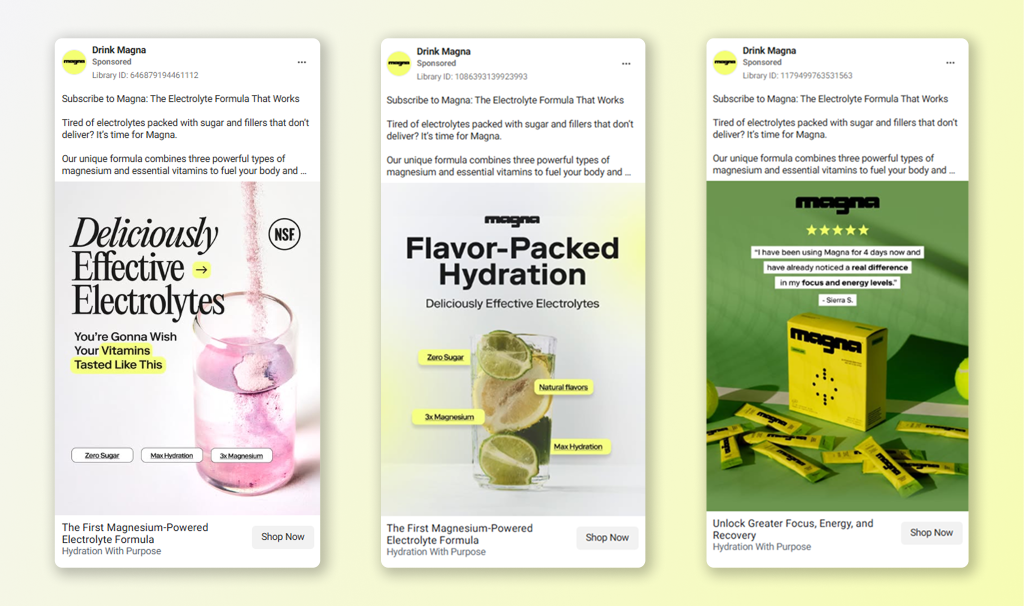
Drink Magna
Drink Magna is a sports beverage brand designed for everyday athletes and wellness enthusiasts. The brand aims to position itself as a daily ritual for active, health-conscious consumers, and this positioning shows in their Facebook ads.
Why it works:
1. Clear product benefits
Drink Magna wastes no time in highlighting what makes its product unique. These ads emphasize key benefits like hydration, helping viewers quickly understand the product’s value.
2. Simple, clean visuals
Bright, refreshing colors like lime green, pink, and yellow reflect the brand’s focus on hydration and energy. The minimalist design ensures that the product and key benefits are the focal points, making the ads easy to digest.
3. Infographic-like style
The ads effectively use infographic elements, labeling benefits and ingredients in a clear, easy-to-read format. This design style works particularly well for health and lifestyle brands because it conveys essential information visually and efficiently.
4. Trust signals
These ads employ another great strategy — they highlight brand’s certifications and customer reviews, which signal product safety and quality and show social proof. This is the key for reinforcing trust for potential buyers and driving more sales.
5. Targeted copy
The ad copy is designed for health-conscious, active consumers. The simple “Question => Answer” ad copy format hits straight into the pain points of the target audience and offers the brand’s product as a solution.
Actionable takeaways:
- Lead with benefits: highlight your product’s top features in bold, visible text so viewers quickly understand why they should care.
- Stick to clean design: use simple, uncluttered layouts with bright color accents to help the product and message stand out without overwhelming the viewer.
- Use social proof: show customer testimonials or ratings on your ad creatives to build trust and help potential customers feel confident about trying the product.
- Address pain points: identify a common problem for your target audience and position your product as the solution in a clear, empathetic way.
These Facebook ads effectively position Drink Magna’s product as the go-to choice for the intended audience. Adopting these strategies can help you create Facebook ads that are engaging, informative, and trust-inspiring.
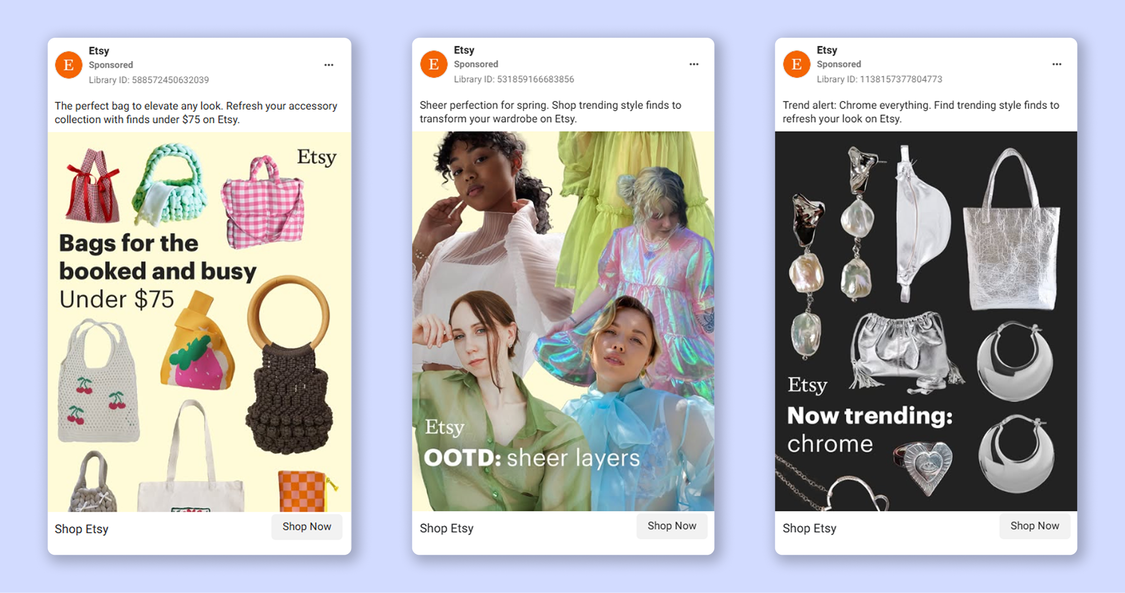
Etsy
Etsy’s Facebook ads spotlight the unique, handmade, and vintage-inspired fashion available on the site. The ads combine trendy visuals with direct messaging, helping users discover items that align with their personal style.
Why it works:
1. Trend-focused themes
Etsy’s ads leverage current fashion trends that resonate with Gen Z, positioning the platform as the go-to destination for trendy, seasonal styles. The ads feature vibrant visuals that highlight individual products, making them feel like a mini catalog. Even in single-image ads, Etsy effectively shows variety and uniqueness.
2. Simple and trendy ad copy
The ads use straightforward copy that emphasizes discovery and curation while also tapping into popular fashion trends. Phrases like “Find trending style finds” and “Shop trending style finds” appeals to the target audience — young, fashion-conscious consumers.
3. Simple color palette
The ads use light colors like pastel yellows for a fresh, spring-like feel and darker tones like black for a sleek, modern vibe. Each color matches the products and a specific trend they revolve around, creating a cohesive look.
Actionable takeaways:
- Highlight trends: keep your brand relevant by showing the latest styles and trends to grab attention.
- Create collections: group similar items together to make browsing easier and help customers find new favorites.
- Use simple copy: let your visuals take center stage and use short, catchy phrases to inspire curiosity and discovery.
- Play with color: choose colors that reflect the time of year, a specific theme, or current trends.
All of this helps Etsy communicate its brand personality and creativity through through the simplest Facebook ad format — single image ads. If your target audience is young, creative, and loves staying on top of trends, you can add these strategies into your playbook.
Monday.com
Monday.com simplifies work routines, helping teams stay organized and on track. Their Facebook ads reflect that by highlighting the platform’s ability to tackle chaos and boost productivity.
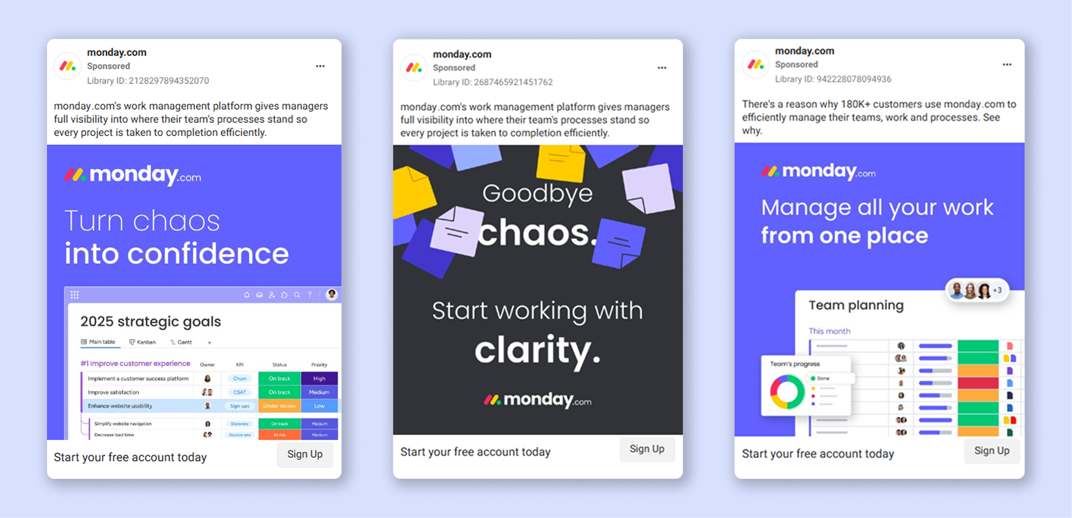
Why it works:
1. Addressing real problems
Monday.com’s Facebook ads directly address a common pain point: disorganization. Phrases like “Turn chaos into confidence” and “Start working with clarity” speak to the frustrations of their target audience. The ads don’t just highlight product features — they present clear solutions to real problems.
2. Showing the product in action
The ads show Monday.com in action, including screenshots of features like task lists and timelines. This visual representation allows potential users to better understand how the platform works and how it can help improve their workflows.
3. Straightforward, no-nonsense ad copy
The copy is simple and to the point. Phrases like “Manage all your work from one place” or “Start working with clarity” quickly communicate the benefits without jargon or unnecessary complexity, and a phrase “There’s a reason 180K+ customers use monday.com” from the third ad sparks curiosity, encouraging people to learn more.
4. Bold and clean design
The ads use bold blue and purple colors that align with the brand’s logo while grabbing attention. The design is clean and organized, which makes it easy for viewers to focus on the key message and product visuals.
5. Friendly, low-pressure CTA
The CTA on these ads — “Start your free account today” — is low-pressure and inviting. It’s offering a free, risk-free way to try the platform, which lowers the hesitation for users not yet familiar with the brand.
Actionable takeaways:
- Address your audience’s pain points: speak to your audience’s challenges and demonstrate how your product solves their problems.
- Show value through visuals: use screenshots, demos, or short clips to help customers understand how your product works.
- Focus on clear messaging: stick to straightforward language that highlights the benefits of your product. Avoid complex terms or vague promises.
- Create recognizable designs: use a consistent color palette, clean layouts, and simple fonts to stand out, especially if you’re advertising a B2B or a SaaS product.
- Make next steps easy: offer low-commitment options like a free trial or a demo to let people explore your product without pressure, and add a matching CTA.
By focusing on problem-solving, using clear visuals, and offering simple next steps in your Facebook ads, you can ads make it easy for potential customers to engage with your business and convert into leads.
Apple
Apple’s ads are famous for their conciseness and simple, but bold design. They use sharp visuals and clear messaging to highlight key benefits, making it easy for users to see how Mac solves everyday challenges.
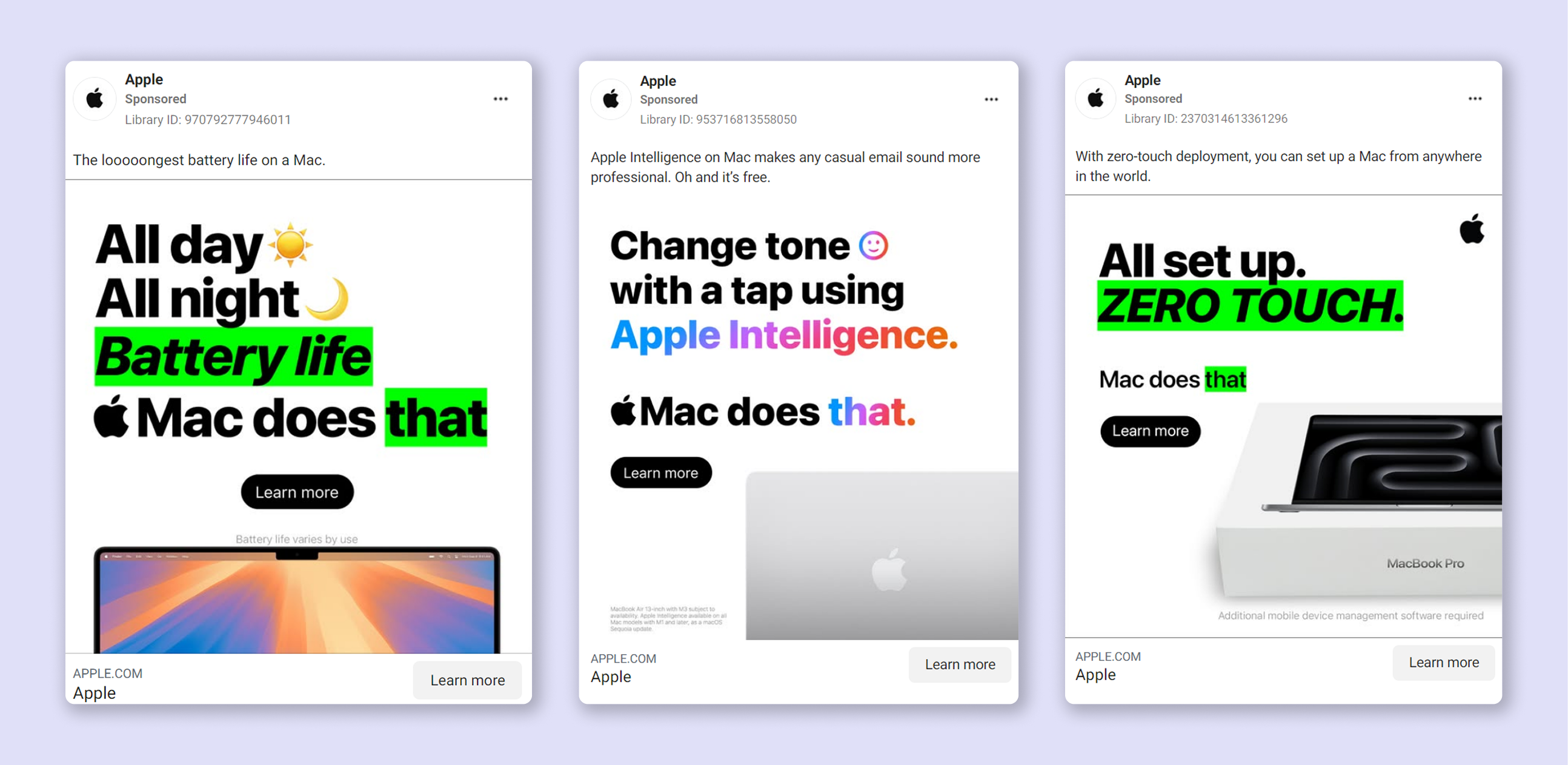
Why it works:
1. Clear, benefit-focused ad copy
Apple’s ads immediately show how their products solve everyday problems. Whether it's battery life, seamless setup, or tone adjustments, they focus on solutions, not just features. This clear, benefit-driven language helps users understand the value of the product quickly, making it easier for them to connect with the message before scrolling away.
2. Minimalist design + consistent branding
The ads are bold yet simple, maintaining a consistent structure across all visuals. With large, impactful headlines, high-contrast highlights, and a recurring “Mac does that” tagline, Apple builds brand familiarity and directs the viewer’s attention exactly where it’s needed.
3. Low-pressure CTA
The “Learn more” CTA is friendly and low-pressure, offering an invitation to explore without pushing users into a decision. It aligns with Apple’s confident branding and makes the next step feel like a natural choice.
Actionable takeaways:
- Address real problems: focus on the challenges your target audience faces and offer clear, easy-to-understand solutions.
- Use bold, clean designs: go for high-contrast colors and minimal layouts to make your ads stand out without overwhelming viewers.
- Keep it simple and consistent: use clear, direct language and a consistent combination of colors, fonts, and taglines to make your brand recognizable.
- Make next steps easy: choose CTAs that feel inviting and allow curiosity to lead users to take action.
By sticking to these strategies, you can create Facebook ads that communicate value and drive action without being too complicated.
Facebook Carousel Ads examples
Nike
Nike’s Facebook carousel ad is vibrant, playful, and energetic, aimed at the next generation of runners with a focus on youth, freedom, and self-expression. The campaign is centered around promoting their running shoe collection with a bold, active theme.
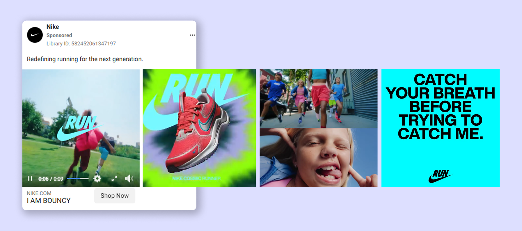
Why it works:
1. Dynamic and exiting visuals
The ad shows kids running, jumping, and playing in both outdoor and urban settings, using fast-paced cuts and dynamic transitions that match Nike’s dynamic brand essence. By focusing on active movements, the ad shows how the product works — on the move, in any environment.
2. Colorful and bold design
Nike uses bright, neon colors and bold text to make the ad pop. The vibrant color scheme gives it a fresh, youthful vibe, matching the ad’s target audience (kids and their parents). Coupled with modern design that highlights the product’s style and function, it helps the ad stand out on busy Facebook feeds.
3. Empowering and catchy slogans
The slogan “Catch your breath before trying to catch me” is a fun twist on competition, speed, and confidence that speaks to young, competitive audiences, and fits Nike’s theme of empowerment. The tagline “I am bouncy” emphasizes essential features for running shoes in a fun way and catchy way — nothing about this ad is boring or bland.
Actionable takeaways:
- Add motion: when advertising products meant for active use, show them in action to demonstrate performance and durability.
- Use bold, bright visuals: vibrant colors and clear text help your ad stand out, especially if you’re trying to reach a young audience.
- Build emotional connection: add inspiring, motivating, or fun slogans to your ads to connect with customers on an emotional level.
If you follow Nike’s example, you can create a strong connection with a young target audience by using dynamic visuals and bold designs.
Converse
Converse’s Facebook carousel ad takes a creative, engaging approach to show their unusual and quirky shoe model. The ad stands out while keeping things simple and on-brand.
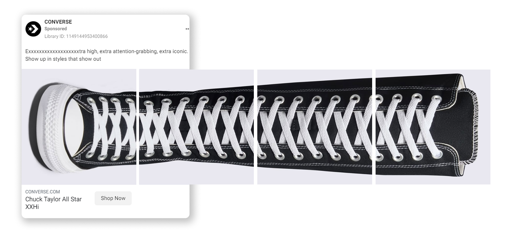
Why it works:
1. Interactive and dynamic visuals
The shoe is split across multiple carousel cards, which creates a cool and engagement-driving effect: users have to swipe to reveal the full product. This design not only grabs attention but encourages viewers to interact with the ad by building curiosity around the shoe’s full look.
2. Attention-grabbing headline
The ad’s headline cleverly plays with the shoe’s height, using repetition to emphasize its dramatic, high-top design. It’s fun, playful, and perfectly aligns with Converse’s bold brand identity and the target audience it’s trying to reach.
3. Clear product focus
The ad is very minimalist and keeps the focus entirely on the Chuck Taylor All Star XXHi’s height and striking style, without any distractions. Without bold colors or fonts, it clearly communicates that this shoe is made to stand out, making it a statement piece.
Actionable takeaways:
- Use curiosity-driven design: build engagement by making the product reveal feel like an interactive experience. This works especially well for carousel ads.
- Make your headline pop: use a fun and playful headline to emphasize key product features and grab attention.
- Keep it focused: highlight the product’s standout qualities without overloading the ad with extra details or distractions.
Curiosity-driven design and minimalist visuals, like in Converse’s carousel ads, can help you create interactive experience that keeps users engaged.
Apple
Just like other Apple ads, this Facebook carousel ad is clean and friendly and professional at the same time, all while promoting the main service — in this case, their free small business services. The ad focuses on making business owners feel supported with expert help and clear solutions.
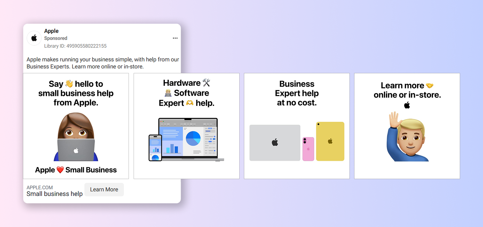
Why it works:
1. Simple and dynamic visuals
Apple’s signature clean design is on full display: a bright white background and fun emojis add personality without clutter. The carousel layout breaks down each benefit (hardware, software help, expert support) into easy-to-understand slides, so everything feels simple and approachable.
2. Familiar branding
By showing iconic Apple products and logo throughout the carousel cards, the ad reinforces trust and brand recognition. Clean fonts and consistent visuals add to that by creating a sense of reliability in Apple’s services.
3. Value-driven messaging
The ad copy makes it clear right away that Apple offers free expert services, which grabs the attention of small business owners looking for help. The friendly and conversational headline creates a welcoming and easygoing feeling, perfect for the intended audience.
Actionable takeaways:
- Keep messaging simple and clear: use straightforward, no-jargon language to tell your audience about the key benefits of your offer.
- Use familiar visuals: showcase consistent branding and recognizable details to build trust and confidence in your products or services.
- Highlight free services: if your offer includes anything free, put this front and center to grab attention and boost engagement.
Apple’s ads show that simple, recognizable visuals and value-driven messaging is the best way to build trust and effectively communicate your offers, especially if you’re advertising tech-related and B2B products.
Doughnut Time UK
Doughnut Time’s Facebook carousel ad is playful, colorful, and mouthwatering, designed to promote their vegan doughnuts in the most tempting way possible. It focuses on celebrating plant-based indulgence with a fun, vibrant twist.
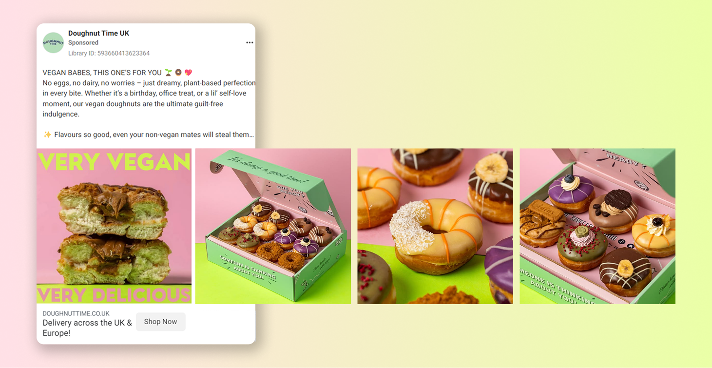
Why it works:
1. Attractive visuals
When advertising anything edible, visuals are going to be the main focus. Doughnut Time perfectly nails their ad visuals: the doughnuts pop against colorful backgrounds, immediately grabbing attention. The carousel format shows off different flavors, keeping users engaged as they swipe through and imagine what to try next.
2. Personalized and fun copy
The ad copy speaks directly to the vegan community in a casual, inclusive way, mentioning all the important details about the product. It also brings in humor to tap into both vegan and general dessert lovers, showing that the product can have a broad appeal.
3. Relevant details in link description
The link description next to the CTA button mentions the important delivery details, pre-emptively answering the questions users might have. This is a great tactic for writing Facebook ad copy: you mention key information potential customers should know about, and placing it in the link description makes it more visible.
Actionable takeaways:
- Use attractive visuals: showcase your product with bright, colorful imagery to grab attention and entice viewers, especially when advertising food or drink items.
- Add fun, personalized copy: speak directly to your target audience with casual, playful language to create connection and excitement.
- Highlight key details: include essential info like delivery or shipping details near the CTA to answer questions and reduce hesitation.
Playful visuals, relatable copy, and highlighting essential details — this can be enough to reduce hesitation and drive more conversions for your business.
To dive deeper into how you can leverage carousel ads for your campaigns, check out our Facebook Carousel Ads guide for detailed strategies.
Facebook Video Ads examples
Duolingo
Duolingo’s Facebook video ads make language learning fun and easy. They often use humor and memes to show that practicing a language can be enjoyable. The ads also feature real-life situations, showing users what to expect when they start using the app.
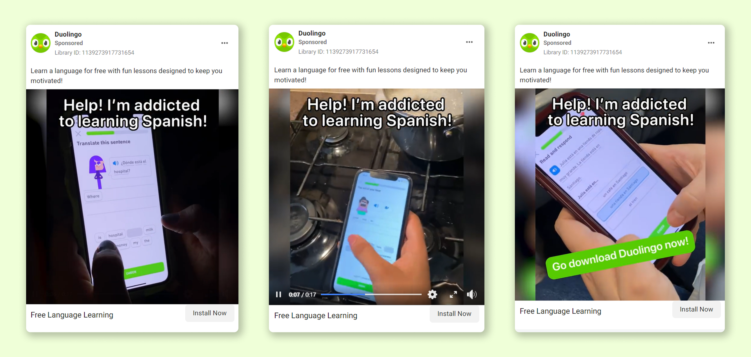
Why it works:
1. Attention-grabbing hook
The ad starts off with a funny line that immediately grabs the attention and sparks curiosity. It also sets the tone for the entire ad, letting viewers know they’re about to see something lighthearted and fun — exactly what Duolingo’s brand personality is about.
2. Everyday use scenarios
Duolingo shows users practicing in everyday situations like in the kitchen or living room, demonstrating how easy it is to incorporate language learning into daily routines. This helps potential users visualize the app as part of their own lives.
3. Quick app demo
The ad gives a quick, engaging look at Duolingo’s colorful, gamified interface. Featuring the app’s interactive design, characters, and Q&A format, it makes the app feel fun and accessible, encouraging viewers to try it out.
4. Benefit-focused copy
The headline highlights key benefits like free access and engaging lessons in simple, clear language. This ensures that viewers immediately understand the value of the app without feeling overwhelmed by too many details.
Actionable takeaways:
- Start with a catchy hook: capture attention right from the beginning with a fun or surprising line that sets the tone.
- Show everyday use: highlight your product in casual, relatable settings to help viewers see how it fits into their lives. Give a brief but clear visual demonstration of your product’s features and appeal.
- Add humor and relatability: use playful language to make your product feel approachable and fun instead of intimidating.
- Focus on benefits: keep ad copy simple and highlight key advantages like accessibility and ease of use.
These strategies can help you can create Facebook ads that are not only engaging and share-worthy but also clearly showing the value of your product.
Salesforce
Salesforce’s Facebook video ad shows how their Starter Suite helps small businesses through conversational storytelling, product demonstrations, and friendly, benefit-driven language.
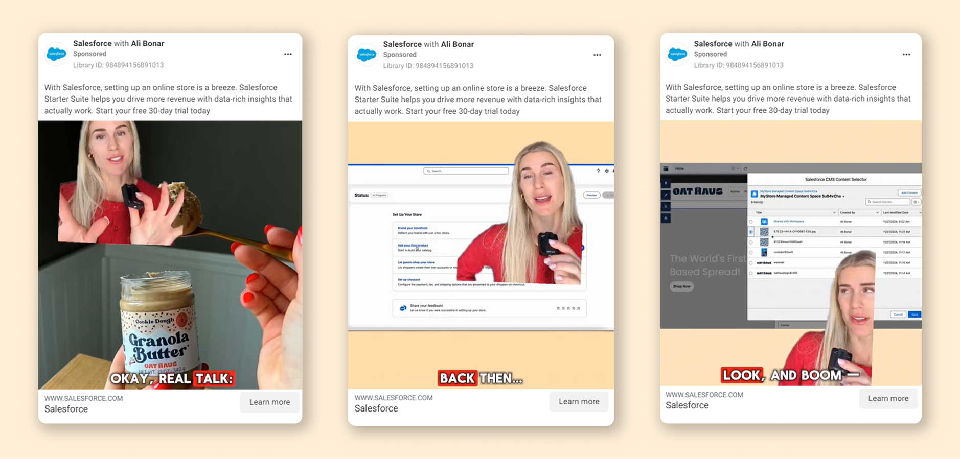
Why it works:
1. Friendly, conversational language
The ad adopts a relaxed, down-to-earth tone that feels more like a conversation than a formal sales pitch. It’s not a company pushing a product but a helpful friend offering advice, which is ideal for appealing to small business owners who prefer a personal touch.
2. Easy-to-understand product demo
Salesforce showcases its tools with short, easy-to-follow clips that walk viewers through key features. The demo highlights how to brand a store, add products, and set up checkout with no tech expertise needed. This approach makes it easy for business owners to visualize using the platform in their own operations.
3. Simple, benefit-first messaging
The ad copy is concise and focused on the benefits — easy setup and increased revenue. There’s no complex jargon or unnecessary details, which helps busy small business owners quickly grasp the product’s value and how it addresses their needs.
Actionable takeaways:
- Use conversational tone: speak to your audience like you’re having a casual chat with a friend to build trust and make your brand approachable.
- Show your product in action: use simple, relatable demos to highlight how your product solves real-world problems.
- Focus on benefits: keep your messaging clear and focused on how your product improves the user’s life, making it easy for them to see the value.
Facebook ads that use relatable language together with simple product demos can help make tech solutions seem easy and fun to use.
Butternut Box
Butternut Box’s Facebook video ad targets dog owners with a clear, personalized offer to test three months of fresh dog food for free. The ad uses local messaging, simple benefits, and relatable visuals to appeal to pet owners looking for healthier food options for their dogs.
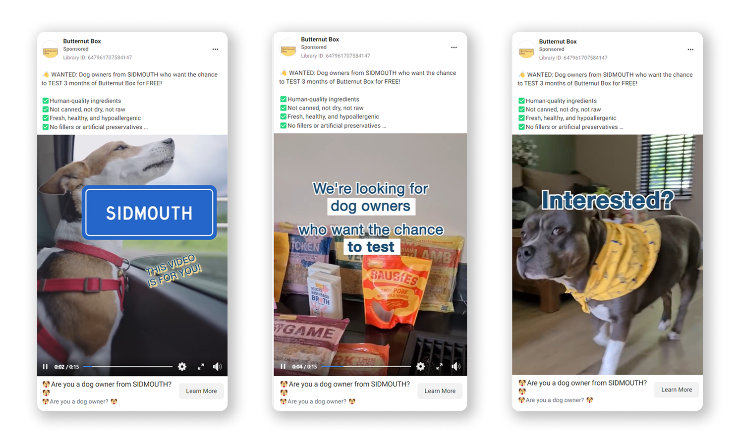
Why it works:
1. Personalized, local approach
The ad grabs attention by starting with “Dog owners from Sidmouth,” which immediately personalizes the message and makes the offer feel more relevant. This local touch builds trust and appeals to the community, making the ad stand out.
2. Clear benefits upfront
The ad highlights the product's key benefits right away: “human-quality ingredients”, “fresh, healthy, and hypoallergenic”, etc. These concise statements make it clear why Butternut Box is a healthier choice for dogs, showing its value quickly.
3. Relatable visuals
By showcasing dogs in everyday situations, like a car ride or relaxing at home, the ad helps pet owners visualize their own dogs enjoying Butternut Box meals. The visuals are familiar and warm, with product shots that make the brand easy to recognize.
4. Low-pressure CTA
The call-to-action feels natural and conversational: “Are you a dog owner from…?” It sparks curiosity without being forceful. Paired with the “Learn More” button and a mention of the free trial, the CTA encourages viewers to take their time and explore the offer.
Actionable takeaways:
- Personalize your approach: tailor your ad to specific locations or audience segments to make it feel more personal and relevant.
- Highlight key benefits: present the main advantages of your product upfront in simple, straightforward language.
- Use relatable visuals: show everyday moments your audience can connect with, helping them imagine how your product fits into their lives.
- Keep the CTA friendly: use a natural, low-pressure call-to-action paired with a risk-free offer to encourage action without pressure.
This example shows how easy it can be to add a personal touch to Facebook ads and make them more relevant. If you’ve got special offers for customers from different locations, try this tactic.
Burga
Burga’s Facebook ads show their collection of phone cases with elegant designs and bold, artistic themes. The ads emphasize beauty and self-expression, using a sophisticated style that captures the collection’s premium feel.
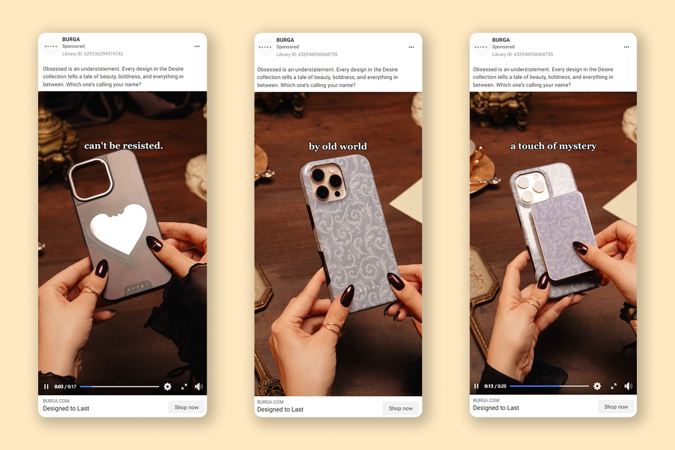
Why it works:
1. Captivating product shots
The ads uses close-up shots of the phone cases to showcase their intricate designs, textures, and build quality. The warm lighting and vintage setting enhance the luxurious, elegant feel, positioning the product as a high-end accessory.
2. Engaging language
Phrases like “can’t be resisted” or “a touch of mystery” evoke curiosity and emotion. These descriptions elevate the phone case from a simple accessory to a statement piece, drawing viewers in with the promise of self-expression and style.
3. Hands-on demo
The ad features a person holding and interacting with the phone cases, giving viewers a clear sense of how the product looks and feels in real life. This hands-on approach helps potential buyers imagine themselves using the cases.
Actionable takeaways:
- Use detailed product visuals: add high-quality close-ups and multiple angles to showcase your product’s design and build.
- Add emotional storytelling: use engaging, evocative language that speaks to your brand’s personality and connects with your audience on an emotional level.
- Show how the product feels in use: include hands-on demos to help viewers visualize how your product fits into their daily life.
By blending artistic visuals, emotional language, and hands-on demos, you can create a premium, inviting atmosphere that inspires shoppers to explore their offerings.
If you’re looking to dive deeper into the world of Facebook video ads, check out our Facebook Video Ads guide for expert tips and strategies.
Recap
To wrap it up, creating effective Facebook ads is all about making your products stand out in a way that feels relevant to your customers. Whether you’re using single image, carousel, of video ads, the goal is to connect with your audience while showing them why your product is worth a try.
With attractive visuals, clear messaging, and a bit of creativity, you can boost engagement and see better results. As you develop your own campaigns, keep experimenting with these strategies and adapt them to fit your unique brand voice.